Module
Time Period
Description
The first step of this project was to research my users and find a problem that my brand could help to solve. I conducted a survey which found that young people generally don’t know about saving methods that are both beneficial and safe. Due to how popular trading and crypto are at the moment, it’s seen that the only way to develop your money is through risky methods. I wanted to rectify this through a bank brand that would help educate young people on safe and reliable savings methods.
With an angle set for the project, I interviewed someone in my target audience about the issue I had found and created an empathy map from the results.


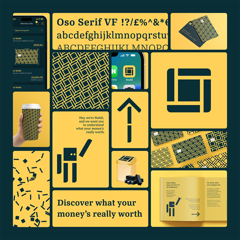
The first step in the brand development was to define my values and from this my name. The name I went for was Stabil, taken from the stability and safety I want my users to feel knowing their money is safely developing to secure their future.
Next, I designed a word mark and brand mark to represent my bank. I started by sketching out ideas and then exploring them digitally, allowing me to find a suitable logo.
I then selected a colour palette that suitably represented my values and brand while also being visually interesting.
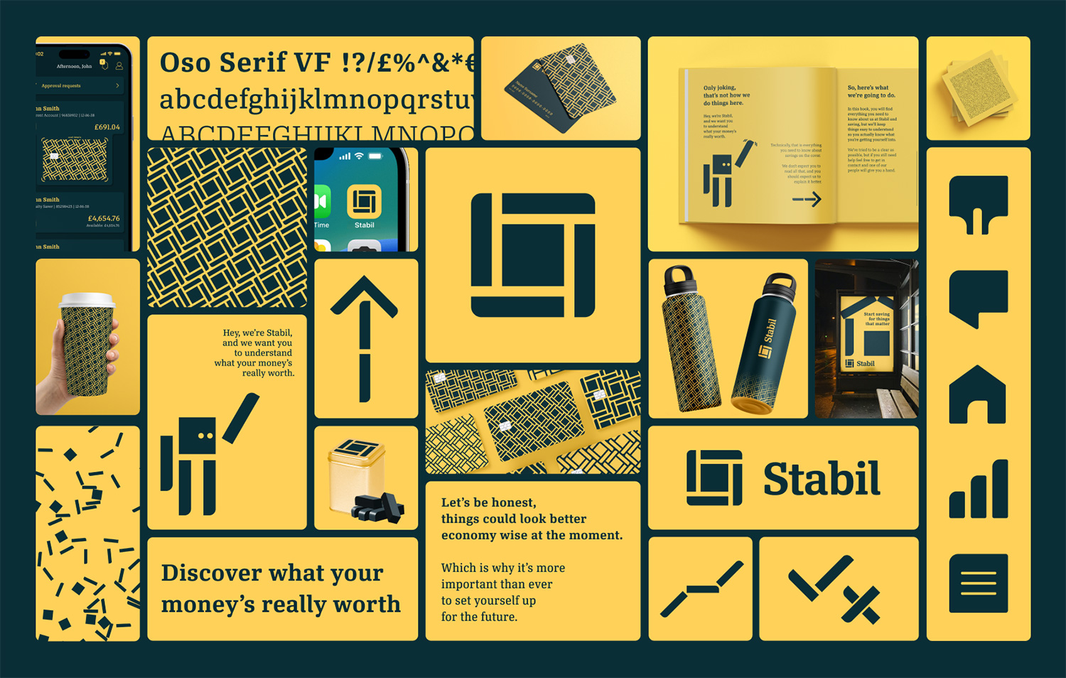
To begin the rollout, I explored how the logo could be used in different ways to create icons and shapes. This would allow me to create a visual cohesion throughout the brand and make it more identifiable.
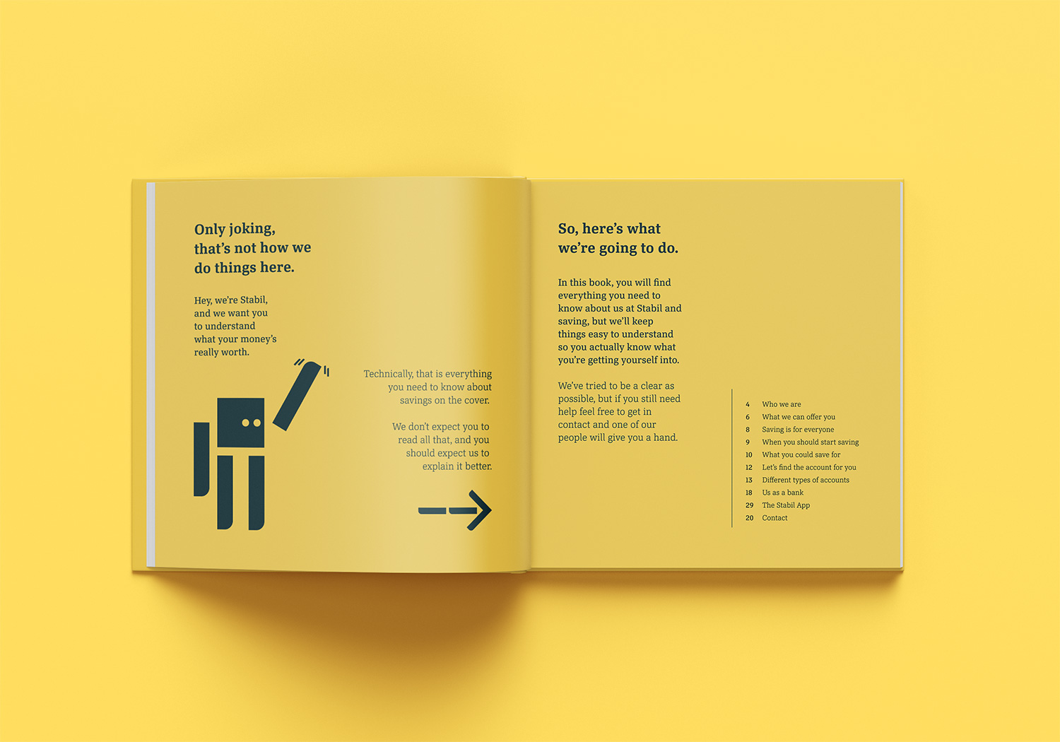
One of my favourite applications of the brand was a book which was to be given to new users and contained an introduction to ways to save. On the cover of the book was a massive sprawl of text which was an extremely complicated explanation of what the book explained. This was to poke fun at the predatory tactics of traditional banks which stop users from using good saving methods.


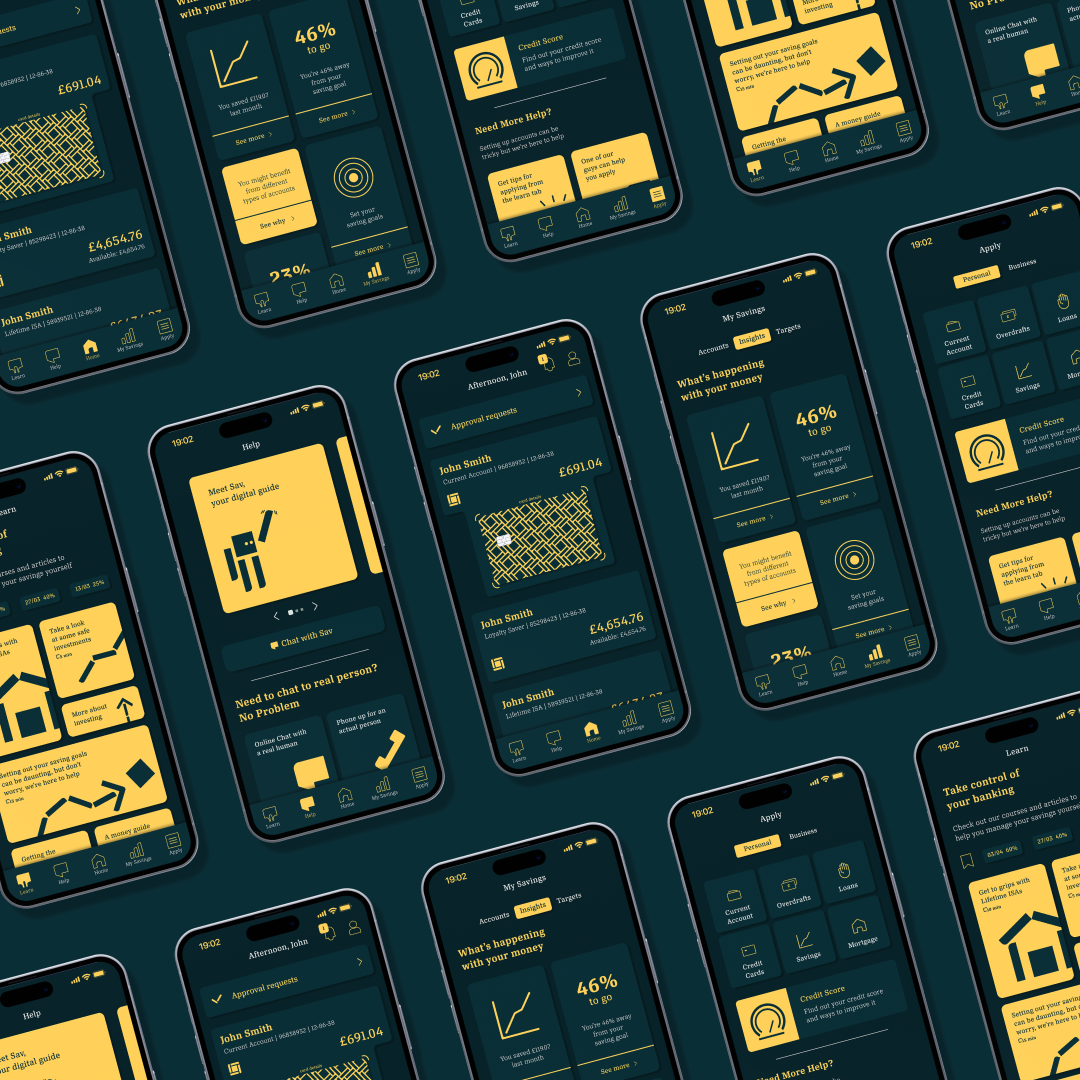
The banking app was designed using the Ulster Bank app as a base. I created an interface inventory of the Ulster Bank app and began redesigning the components to build a new component library which was cohesive with my brand. Certain screens were rebuilt using the restyled components, while some were iterations to improve the user experience.
Prototype
When exploring the landing page, I wanted to play into some narrative aspects to create something that was engaging and memorable. I experimented with how the logo could react to gravity through a physics simulator Figma plugin, and used that as the central motif on the page, which helped to create and engaging page which felt different and uinque.
Landing Page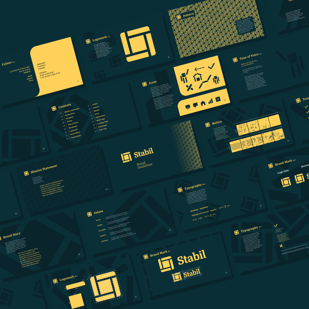
The final part of this project was create a Brand Guideline Document. This was a really interesting part of the project as it made me view the brand differently when I saw all the work I had done on it at once. It helped me to confirm that it did help the problem I had wanted to solve, by giving young people a platform to help save and develop money.
Brand GuidelinesThis was a really interesting project for me. While I got to explore a lot through the design aspects, what I enjoyed most was the thinking around user-brand relationships and the psychological side of branding. Looking back on this project, the main thing I would have liked to explore further was the landing page. I think there could have been a way to achieve my original vision, however, I had to compromise due to time constraints. Overall this project was a huge learning opportunity and allowed me to create a really thorough and complete product.