Module
Time Period
Description
For this project, I chose to look at my movements over a week. While the project allowed for different data sets to be used, I thought an interesting approach would be to use one data set and explore how different visualisations could reveal different information about the data. I began by recording everywhere I went during a week and the distances between locations.

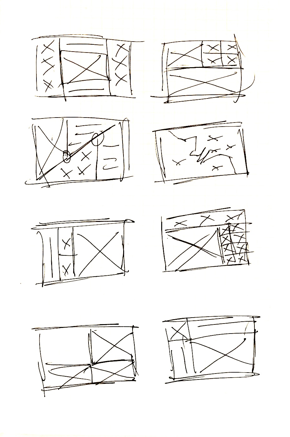
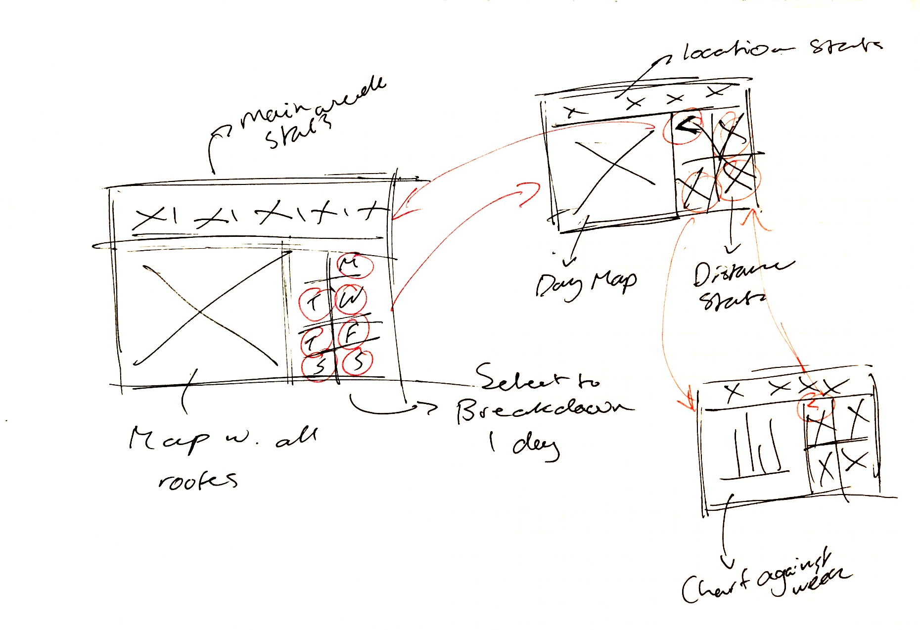
My next step was to get a general idea of the layout for my dashboard. I started by quickly sketching some layouts before deciding on the one I felt worked best. I then re-sketched my selected layout and the variations I would need. This was useful as it was a really quick way of getting the layout sorted. While the sketches are very rough, it’ll be enough to get me started and having the layout will allow me to focus on the style aspect of the dashboard.
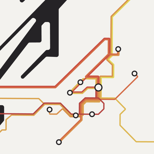
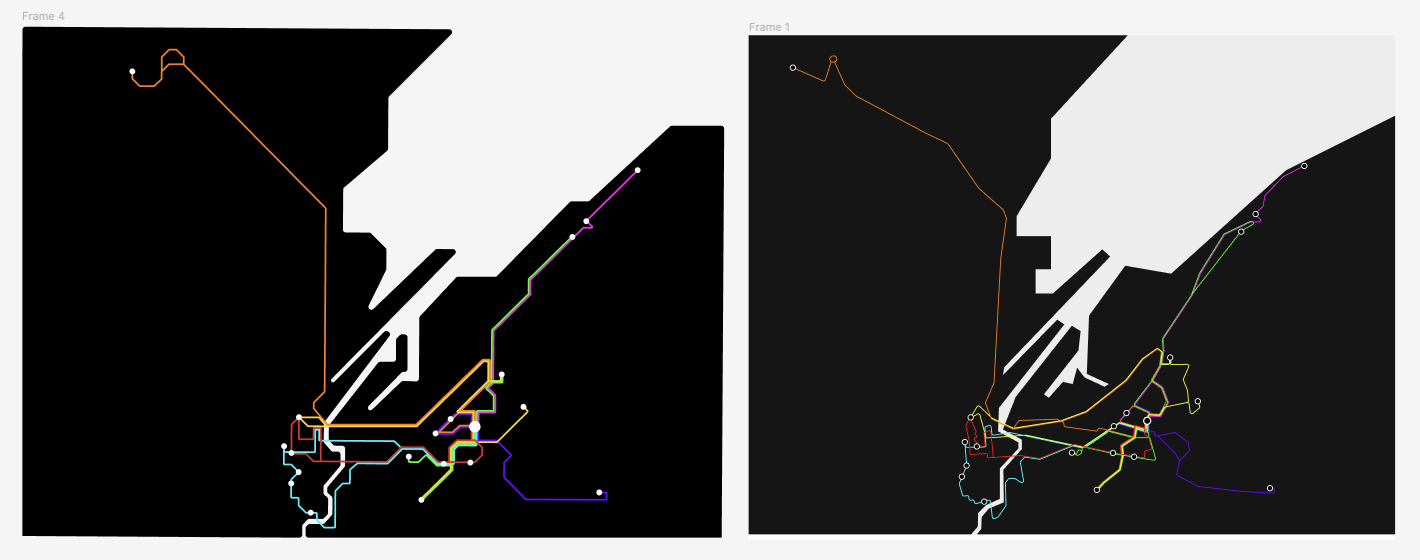
To begin development, I designed a tube map-style diagram of my weekly travel as I knew this was what I wanted to be the centrepiece of my dashboard. I had tried more accurately mapping out the routes, however it felt too messy and what I wanted to show was each stop rather than exactly what route was taken, so a geographically inaccurate map would work better.
I then built the map into a rough wireframe and changed it to a more analogous colour palette to keep the dashboard more visually cohesive.
After wire framing, I built up the dashboard, adding in more data and icons to complete the screen.

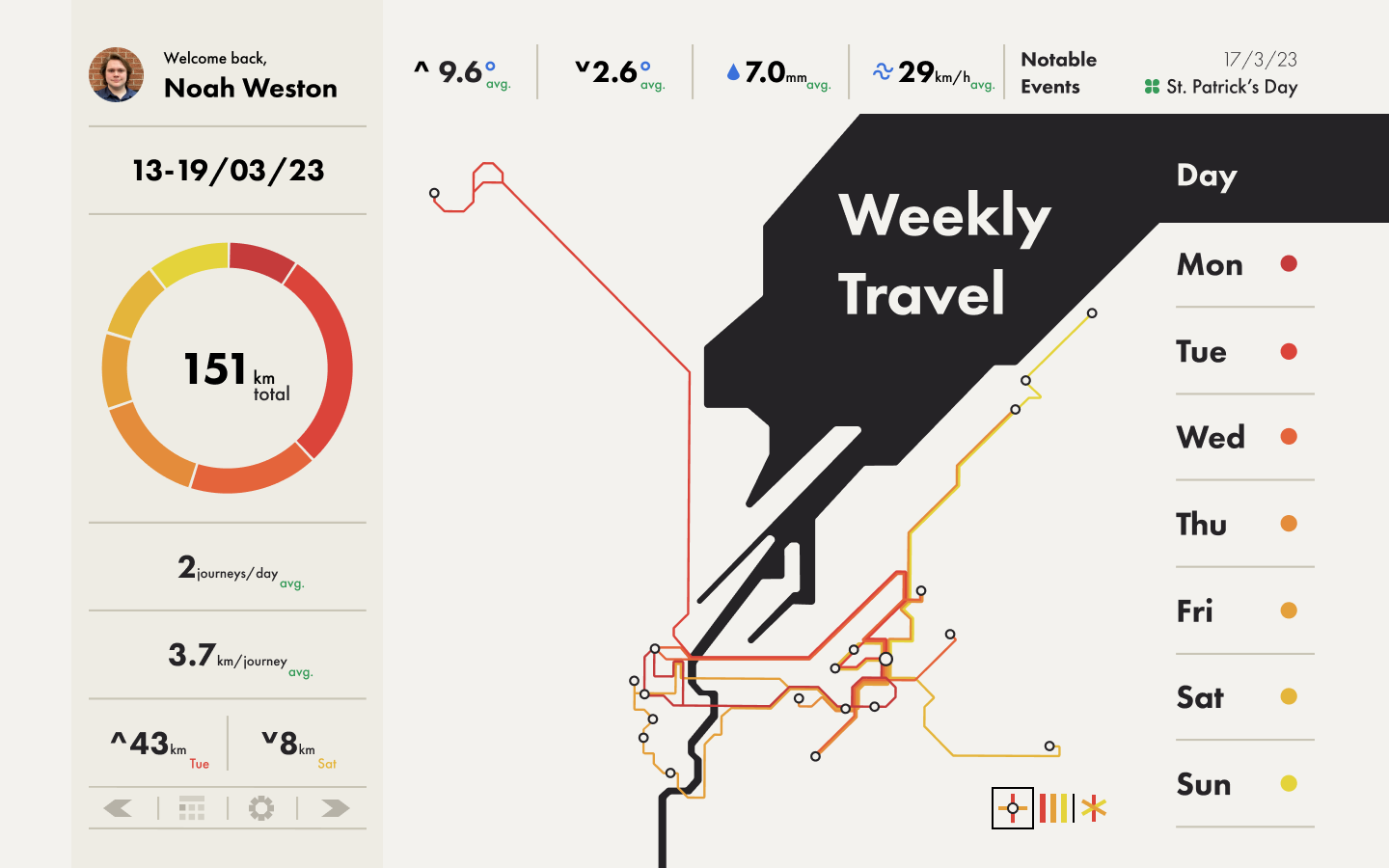
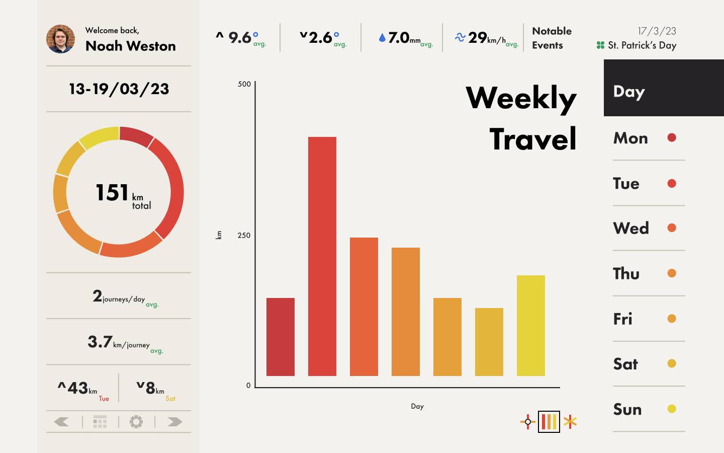
I explored a range of other visualisations to show different aspects of the data. The ones I settled on were a bar chart and radar plot.
The bar chart worked well as it was better at showing the overall distance, whereas the map was better at showing the locations I went to.
The radar plot was an interesting visualisation as it showed how far I went but also showed the distribution of the distances. Due to the multiple ways this showed data, I created a value from the figures which I called "travel density", as a way of comparing both how far and in how many stops I went each day.


The final part of this project was prototyping the whole dashboard in Figma. I got really in-depth with this part, exploring the smart animation feature thoroughly. The prototyping went really well and I was able to create a high-fidelity version which showed everything I wanted to.
This was a really fun project for me due to how complex I made it for myself. I really pushed myself to prototype as far as possible and experiment with smart animations which went really well. It was definitely a struggle keeping track of all the data and prototyping but I feel I was able to create something I was really proud of and I learnt a lot from it.